The Beijing Olympics 2022 will go down in history as the first city to hold both summer and winter Olympic and Paralympic games.
Thus, they have worked hard to create an iconic logo representing the core value of the international sports event and the country.
As the 2022 Winter Olympics host, the Beijing 2022 Organising Committee (BOCOG) unveiled a new event logo. The logo was meaningful and inspired by Chinese calligraphy and traditional seal cutting.
Let’s take a closer look at this iconic design, and how can we create a similar one using an Ai Logo maker!
Unveiling the Beijing Olympics 2022 logo
The logo was designed by the deputy director and international artist Lin Cunzhen, known for her standardization manual of the previous emblem of the Beijing 2008 Olympic Games.
Let’s unveil the Beijing Olympics 2022 Logo through the perspective of the emblem and symbols.
The Emblem or the Symbol
The Beijing 2022 emblem is a stunning blend of traditional and modern Chinese design. The marks represent tradition while featuring elements that illustrate life’s vitality in summer and winter sports – showcasing how passionate we are about this fantastic game and event!
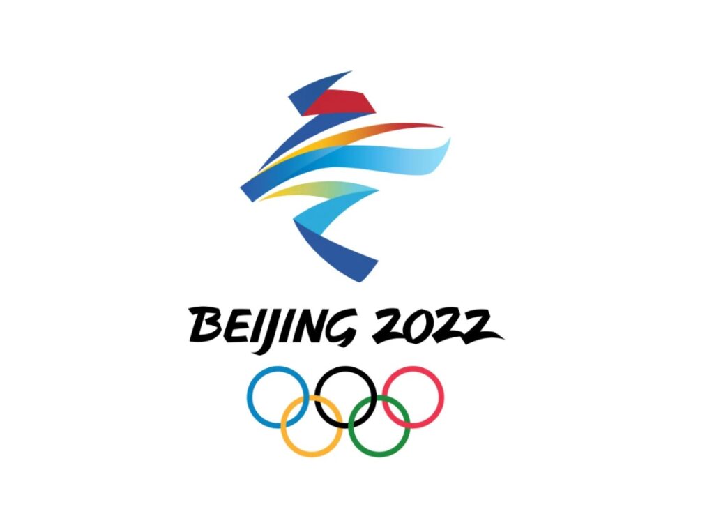
The Olympic logo is called the ‘Winter Dream.” The emblem was inspired by the Chinese character 冬 or the word for “winter.” Some of the elements:
- Emulates the styles of a skater at the top and a skier at the bottom.
- The flowing ribbon-like motif between them signifies the locations of the winter Olympic Games or where athletes compete.
- The fireworks-like theme represents how these games are linked to the Chinese New Year, which occurs in mid-January or February. The typeface in the logo represents China’s rich history and tradition.
On the symbol, three colors stand out: Blue (represents hopes, the future, and purity), red (fire and dreams that drive us forward), and yellow (signifying victory through hard work).
All things considered, the colors red and yellow were inspired by the colors in the Chinese flag, with a connection to the event’s concept of ice or snowfall.
This makes it all come full circle, allowing us to see how everything related to the logo design comes together to create a cohesive brand identity system that is easy for people worldwide to understand.
It’s also vital to consider how each piece functions within its own context – a single color may not make sense on its own. Still, when combined with other elements, such as typography or imagery, these colors begin to make sense!
The Slogan
The Slogan “Together toward a Shared Future” is the tagline or motto for the 2022 Olympic Winter Games.
After a rigorous selection process, 11 motto proposals from Chinese universities were shortlisted to create the Beijing 2022 Olympics’ official theme.
The phrase reflects the need for individuals from all walks of life to come together and work toward a brighter future. It encourages unity among athletes from various countries, especially during difficult times.
It was designed to show that there are always ways to come together, achieve progress, and be optimistic tomorrow despite differences. It also embodies the core values and vision of the Olympic Movement to overcome challenges with help from others in the community- locally and globally!
The motto also considers the Paralympic Games‘ core features, in its role as part of pursuing world peace with itself through sport at every level – whether it be physical disability or mental illness- upon which we can build empathy toward others who share similar challenges throughout society.
Beijing 2022 Paralympic Logo
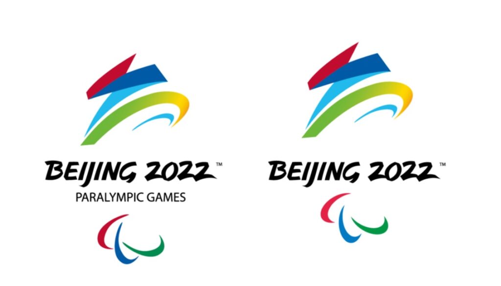
The logo for the Paralympic Winter Games is similar to that of the Olympic Winter Games but with a few modifications to make it more significant for the athletes.
The Paralympic logo incorporates an abstracted Chinese character; ‘飞‘ meaning “fly“. It was named “Flying High” which emulates the form of a wheelchair-bound athlete and reflects hope, soaring past any doubt or fear while reaching for victory at the finish line.
The Paralympic logo was updated to match the standards of Paris 2024, Milan-Cortina 2026, and Los Angeles 2028. The refreshed Agitos symbol is added in its place, while the “Paralympics” text has been removed altogether!
What Can We Learn From This?
There are different ways our team at Logo Maker AI can design sports logos or the Olympics Logo for this instance.
But as we’ve shown in our analysis of the Beijing Olympics 2022 logo and thought process, designers must consider all the factors that go into developing a great design.
The logo or symbol, phrase, colors, and typeface are all part of this.
The logo should be simple, distinctive, and adaptable enough to work on various platforms while maintaining its meaning and effect.
Both logos were designed with great care and consideration to symbolize the Olympic Movement’s ideals and goals!
Note: 2022 International Olympic Committee All Rights Reserved.
