When it comes to fonts, there are many different types of font to choose from. And each style has its own unique purpose and meaning. But, the type of font that you choose can dramatically affect your users’ perception of your brand and, therefore, their likelihood of converting.
So how do you know which font is right for your website? And more importantly, what do these different fonts mean for your website?
In this blog post, we’ll look at the different types of fonts, and the psychological use for each of them.
Five Different Types of Fonts
Whenever we see a written piece, we usually don’t think about the different types of fonts used, and we just focus on the message that is being communicated.
But, typefaces, like music, play a significant role in helping us connect with the world around us. When you choose a typeface for your project, it needs to work in harmony with your design. The right font can make or break a project, especially when it comes to branding.
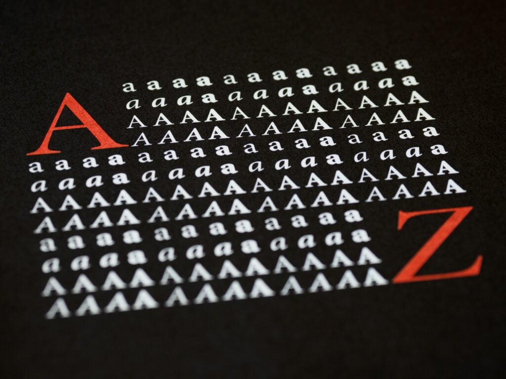
That’s why we’ve listed out the different typefaces that can all be broadly classified into five main categories: serif, sans serif, slab serif, script, and decorative.
1. Serif fonts
Serif fonts are considered old-style and one of the most traditional fonts. They are usually used for printed materials such as books, newspapers, and magazines as they are easy to read and convey messages quickly and effectively.
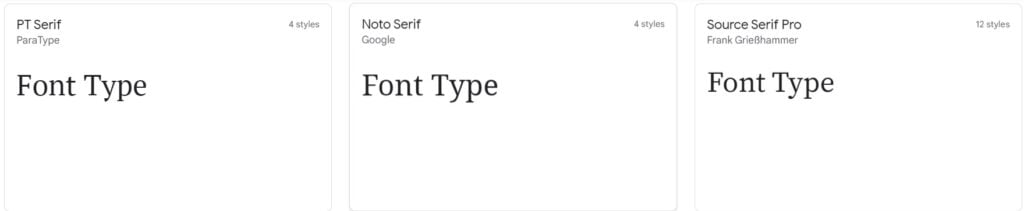
The defining characteristic of serif fonts is the small lines (or “feet”) that extend from the ends of each letter. These lines help the eye follow the text and make it easier to read for long periods.
Some popular serif fonts include Times New Roman, Georgia, and Courier, commonly used for professional or formal documents.
Psychology of Serif Fonts
Serifs help differentiate between one group of letters and another, so it’s easier to track lines of text as your eyes follow along. This is especially helpful for people who read a lot and don’t have great vision.
When you shop online, serif fonts are the easiest to read, especially when the text is small, so they are ideal for titles of products and thumbnails.
2. Sans Serif Typefaces
A sans serif typeface is a typeface that does not have the small lines at the end of each letter (known as serifs). They are usually simpler and more modern in appearance than serif typefaces, and they are often used for headlines and titles.
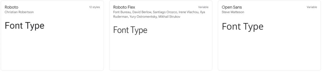
Some popular sans serif typefaces include Arial, Helvetica, Geometric Sans Serif, and Grotesque Sans Serif.
While sans serif typefaces are typically more legible than serif typefaces in small sizes, they can sometimes be more challenging to read in larger sizes. Some Sans Serif typefaces work well at both large and small sizes, while others may become difficult to read when used at smaller sizes.
As a result, they are often combined with a serif typeface for body text.
Psychology of Sans Serif Fonts
Sans serif fonts have more open spaces between the letters, making them easier to read. It’s easier to identify groups of letters because the line between letters is not as bold. It also reduces the time it takes to read a line of letters because there is less to process.
These are useful for headlines and other small texts because it is harder to read in a large block on a page, and it is also easier to read on small devices like your phone.
Sans serif fonts also allow your mind to fill in the blanks, so you don’t need to concentrate as hard. They are suitable for when you are skimming and want to look at the big picture.
It is also a good font to use when you want to make a lot of information available quickly without thinking too hard. When you’re designing a landing page, for example, you want to give someone a lot of information in a short amount of time. Sans serifs are ideal for this kind of situation.
3. Slab Serif
Slab serif fonts have been a popular choice for web designers and print designers alike since the 19th century. Unlike traditional serif fonts, which tend to have thin, delicate serifs, slab serifs are much bolder and more pronounced.
These thick, blocky fonts, which were extensively used back in the early 20th century, are easy to read and convey a sense of strength and stability, mainly for headlines and other short bits of text.
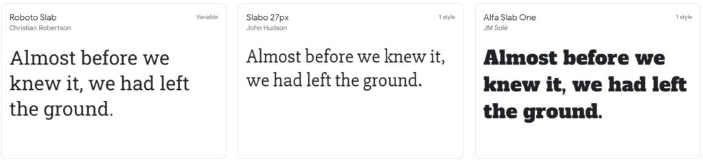
Some of the most popular slab serifs are Rockwell, Egyptienne, and Clarendon. Although they are mainly used for headlines or titles, they may not be a good idea for long texts because it is hard to read, especially when the text is in small font.
But, when choosing a slab serif font, it’s essential to consider the font’s personality. Some slab serifs are more playful, while others are more serious. The right font can help set the tone of your website or document, so choose carefully!
Psychology of Slab Serif Fonts
Slab serifs are great for conveying an authoritative tone, mainly because they are easy to read at any size. They are also easy to make out from far away, even when small letters are.
When you shop online, slab serif fonts are the easiest to read, especially when the text is small, so they are ideal for titles of products and thumbnails.
This kind of font gives your mind something to hold onto, which helps you scan them. These fonts are also helpful in emphasizing certain words or phrases.
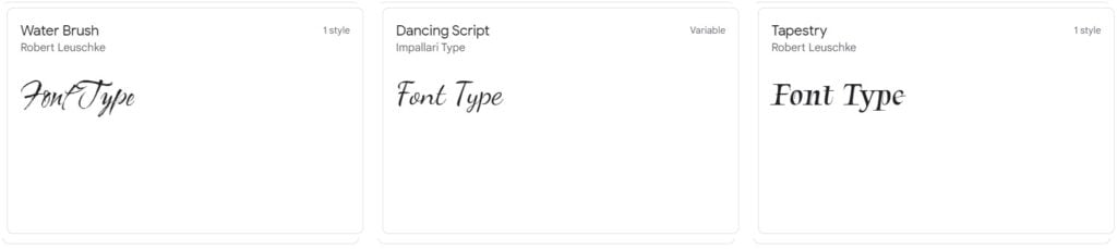
4. Script Fonts
Script fonts mimic the handwritten lettering of an artist or calligrapher. They are designed to look like they were written by hand. As a result, they often have a more personal feel than other fonts.
The most popular examples are Brush Script, Edwardian Script, and Casual Script.
The script fonts can be used for various purposes, from invitations and greeting cards to web design and branding. But when choosing a script font, it’s important to consider the tone you want to convey.
For example, softer, more looping fonts convey a feeling of elegance and sophistication, while angular fonts can convey energy and excitement. With so many options available, it’s easy to find the perfect script font for any project.
Psychology of Script Fonts
Script fonts are the easiest and fastest to read, and they’re less consistent, making it easier to catchwords as your eyes scan across a line of text. They also convey a more intimate tone suitable for logos and invitations.
It is a fun way to convey lots of information. They are also good for expressing yourself because you can add little flourishes and swashes to convey different emotions.
They are suitable for headlines and logo designs as they are descriptive and easy to read at a glance.
5. Decorative Font
This one will make your logo stand out, and it adds a personal touch to a logo that you can’t get with other fonts. They are a fun way to add an individual touch to anything you are designing.
This font is the best choice when you want to give the impression of a personal and friendly message. Think of it as the handwritten equivalent of a sans serif font. This can be great for logos or even headlines.
Psychology of Decorative Fonts
Decorative fonts are the most fun to read. They force your mind to make an extra effort, so you can’t skim over the text as quickly. Why? Because they have mismatched line weights, exaggerated serifs, and often ornamentation.
While they are not as easy to read as traditional fonts, they can be used to add personality or style to a piece of writing.
They also help you express your emotions because you can use them to draw on other fonts, allowing you to convey a wide range of emotions.
But, it’s vital to ensure that the font is appropriate for the audience viewing the document. A font that is too ornate or difficult to read may cause some viewers to lose interest in the document, so only use them whenever necessary.
Get the Fonts Right
Display fonts are an essential part of setting the tone of your website or document, and getting them wrong can ruin a project.
Some fonts can make a message seem warmer or colder, while others are meant to convey authority and command, and others are intended to express humility and openness.
Choosing the right font is all about finding something that works for both your design and the reader’s psychology. This can be very important when creating a marketing or promotional message.
Remember, knowing the different fonts can help you choose the right one for whatever project you’re working on. So next time you’re picking out a font, keep these five categories in mind!
But there’s more…
If you want to create a logo design for your brand using Logo Maker AI, you can easily customize the logo templates and choose among the font typefaces for the final output!
Just head into our website, type your name, choose and click the ‘edit’ button, and there you go!