Wegovy is a new weight loss drug that has been firing up the internet lately. Many of us are fond of weight loss supplements – especially those with specific dietary needs. This is why a handful of pharmaceutical companies are developing weight loss drugs to keep up with the demand.
But of course, keeping up with the demand also means strengthening the product’s brand identity. And what’s a better way to do that than designing a logo, right?
The Wegovy logo is a groundbreaking design in the waves of the health and fitness industry. Even though it is new, many individuals are already scrambling the market to look for it! Thus, the importance of branding! With that said, let’s look at the Wegovy logo and analyze its branding and history.
What is the Wegovy Logo?
We can all agree that a logo must contain and represent the company’s mission, values, goals, and overall aesthetic. In the Wegovy logo, several key elements identify the visual impact and recognition upon closer examination. Here are some things we love about it!
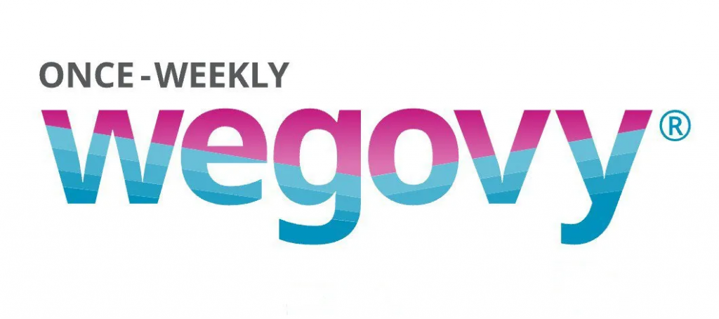
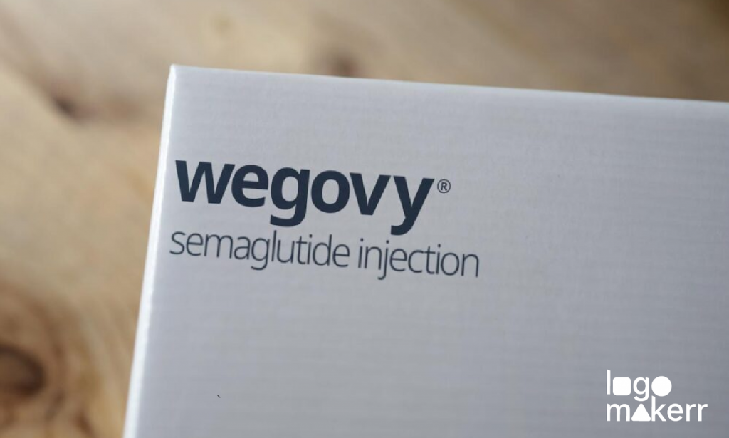
Photo Credit: All Things Nordic
As you can see, the color scheme of the Wegoy logo is in shades of blue and purple. Let’s take a look closer why;
Blue – This color evokes nothing but trust and vitality. Since Wegovy is a company from the pharmaceuticals industry, it must associate its logo with many touches of blue to represent that it cares about the patients or individuals in need of a weight loss supplement. Without showcasing trust, it’ll be hard for the company to market the product!
Purple – The purple color in the Wegovy logo states royalty, celebration, and luxury. This color touches everyone who wants to go hand-in-hand with a weight loss supplement that is FDA-approved and high-quality. A lot of commercial services also use the color purple to represent the main essence of their company without overdoing it.
In a nutshell, the Wegovy logo is a design that truly resonates with its target audience. It also strengthens Wegovy’s brand image as well as its brand strategy.
Typography of the Wegovy logo
The typography is one of the most essential things for a logo. In the case of Wegovy, the company choice is likely to be clean, modern, and easy to read to convey a sense of reliability and credibility in the weight loss industry.
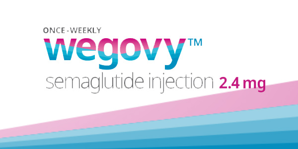
Photo Credit: myBMI
As you can see, the word ‘Once-weekly’ identifies how much you should take in a week. Doing so prevents confusion among consumers and showcases how Wegovy is an advanced weight loss treatment for all.
The word’ semaglutide injection 2.4mg’ is also included in some parts of their branding to inform the consumers of the supplement’s main ingredient. They also want to impart that Wegovy is an injectable prescription medicine.
Beyond the logo, consistent typography choices across all brand materials, such as packaging, website, and marketing materials, help create a cohesive and recognizable brand identity. Wegovy needs to maintain consistency in typography to strengthen brand recall and establish a strong brand identity across the competitive pharmaceutical market. After all, we know that the industry has highly competitive companies like Johnson&Johnson and Novo Nordisk.
The symbols behind the Wegovy logo
The symbol behind the Wegovy logo is the product itself. This is a very effective marketing strategy as the audience will instantly recall and know what the supplement looks like should they buy it.
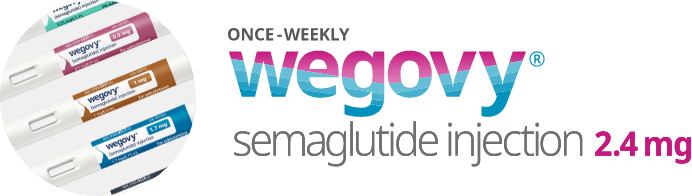
Photo Credit: novoMEDLINK
In terms of the symbol shape, the company preferred it to be round. This represents unity and continuity, suggesting a holistic approach to health and well-being. It also showcases the effective communication of the company in terms of its commitment to providing trustworthy solutions for weight management. No wonder the product has been killing the market since its launch!
Analyzing the Wegovy logo: Shape
The shape of the logo is a rectangle. It embeds the name, symbol, typography, and color of the Wegovy logo. The shape rectangle helps the audience identify gaps or inconsistencies in how the brand is perceived. It’s like listening to the user’s feedback straight away!
In terms of competition, many pharmaceutical companies also have their logos shaped in rectangles. This is probably because of the ease of refinement, especially if the company suddenly wants to modify its logo and resonate with its target audience.
Design Your Drug Store Logo today with this AI Logo Generator
It’s easy to get caught up in many rival companies in the pharmaceutical industry. But you have to know that doing the right thing every day is the move you need to do consistently to get there!
So if you are ready and up for it, it’s time to design your very own drug store logo with an AI logo generator like Logomakerr.ai! You just have to enter your drug store’s name and select keywords related to your business, such as “pharmacy,” “medicine,” “health,” or any specific theme you want your logo to convey!
Then, customize your logo according to its color, brand image, and file format. Yes, it’s that easy!
For some ideas, you can also incorporate a symbol to your logo, like medical symbols, pills or capsules, a cross or plus sign, nature elements, and more! You must also learn about color psychology to ensure that you represent your brand well.
Final Thoughts
Understanding the journey of Wegovy’s branding can inspire us to rethink our own approach to visual identity and branding strategies. What other logos and brands should we analyze next? Let us know!